
Think of web design and e-commerce as two sides of the same coin. You simply cannot have a successful online store without a design that works. It is about so much more than just looking good; it is about crafting a digital experience that effortlessly guides people from their first click to the final checkout.
Your website needs to be your best salesperson, working 24/7.
The Blueprint for Web Design and E-commerce
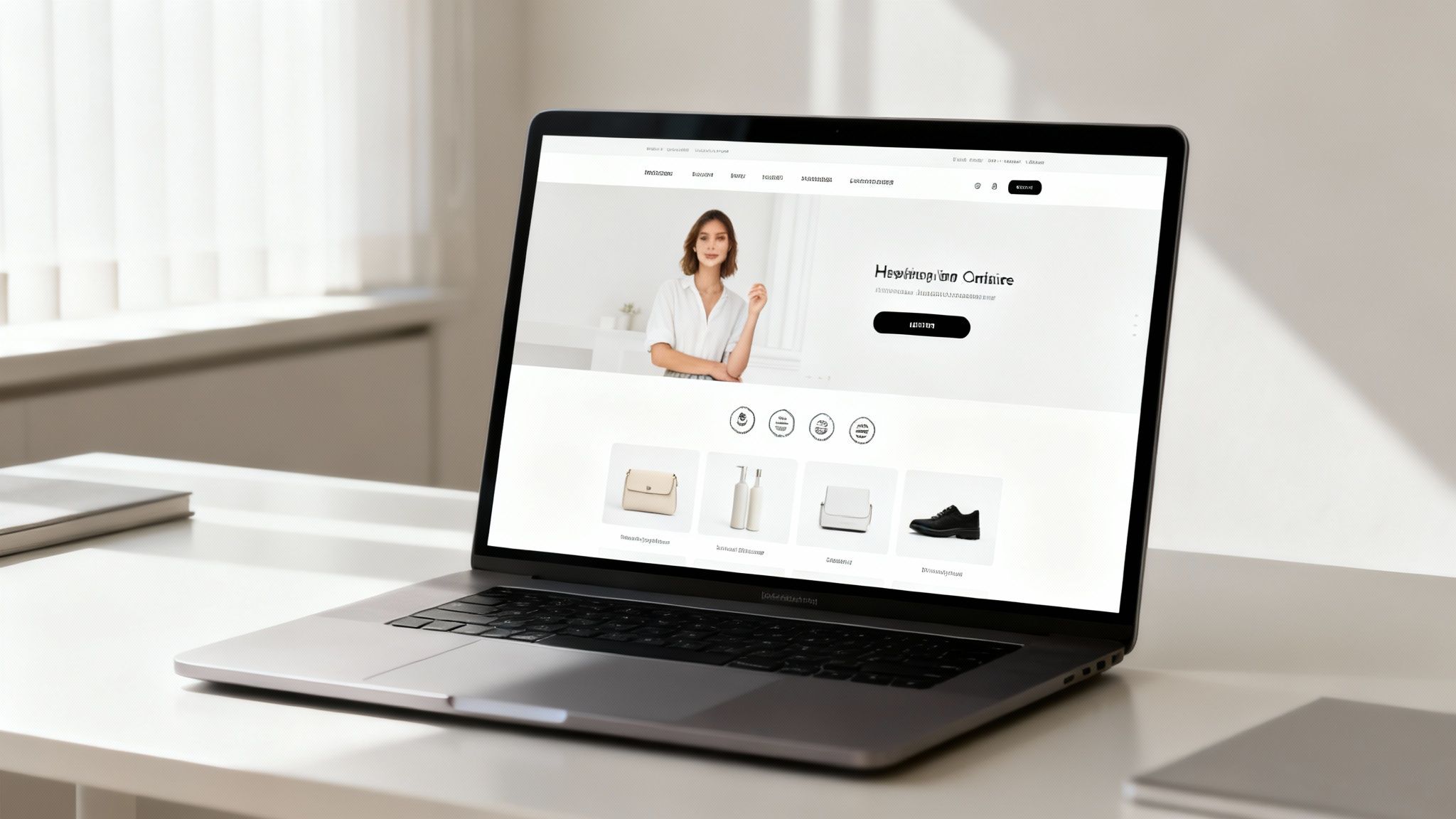
Imagine your online store is a real, physical shop. Every single detail from the layout to the lighting sends a message and influences whether someone sticks around, has a browse, and eventually buys something. The link between smart web design and strong ecommerce sales is that direct. It goes far deeper than just pretty visuals.
Every choice you make, whether it is the colour scheme or the font, has a real impact on a visitor’s trust and their willingness to buy from you. These are not just creative whims; they are crucial business decisions. Consider this: 94% of first impressions are tied directly to your site’s design. A clunky experience will send a potential customer straight to your competition in a heartbeat.
Building Your Digital Storefront
Let us stick with that physical shop analogy. Your homepage is your shopfront. It needs to be inviting and instantly tell people what you sell and why they should bother looking further. If they land on your site and feel confused or overwhelmed, they are gone. It is the digital equivalent of walking into a messy, disorganised shop and turning right back around.
Good, intuitive navigation is like having clear signs in your aisles. Customers must be able to find what they are looking for without getting frustrated. A logical menu, well-defined categories, and a search bar that actually works are non-negotiable tools for guiding them through your products.
From Browsing to Buying
The last piece of the puzzle is the checkout, which is your cashier. A slow, complicated checkout process is one of the biggest reasons people abandon their carts. By making this final step as simple and painless as possible, you remove the last barrier and help seal the deal, rounding off the great experience you have built.
Solid design principles are the foundations of trust. They turn casual window shoppers into repeat customers by creating an experience that’s not just nice to look at, but is also seamless, intuitive, and reliable.
Getting these core ideas right is the absolute first step to building a successful online business. While aesthetics and trends will always shift, the fundamental principles of good user experience do not. You can see how these ideas have held up over time by looking into the evolution of web design. Focusing on these essentials from the start ensures your ecommerce strategy is built to last.
Creating a User Experience That Converts
Ever landed on an online shop and just clicked with it? Everything is easy to find, the whole process feels smooth, and before you know it, you are at the checkout. Now, think about the opposite: a confusing site that makes you want to close the tab immediately.
That difference is user experience (UX). Great UX is not just about looking good; it is about designing a seamless path that turns a curious visitor into a happy customer. It’s the digital version of a warm welcome and a helpful shop assistant, all rolled into one.
Every click a user makes is a vote of confidence. When your design is clear and intuitive, it removes hesitation and builds the trust needed to make a purchase feel like the natural next step.
Designing a Frictionless Customer Journey
The first step is to clear the clutter. A website crammed with popups, clashing banners, and too many messages is the online equivalent of a messy, disorganised shop floor. It’s overwhelming. The aim is to create a clean, obvious path for the shopper to follow.
Next, let your products shine. Since your customers can’t physically touch the items, your product photography has to work extra hard. Use high quality images that show your products from multiple angles, in use, and in detail. Make them feel real enough to reach out and grab.
Building trust is a quiet but crucial part of the journey. Small, thoughtful details can make a massive difference in how credible your store appears.
- Security Badges: Seeing familiar logos from payment gateways and security firms instantly tells a customer their details are safe.
- Clear Policies: Do not hide your shipping and returns info. Making policies easy to find shows you are transparent and have nothing to hide.
- Customer Reviews: Real feedback from other shoppers is powerful. It shows that people have bought from you before and had a good experience.
These elements work together to dismantle any doubts that might cause a potential customer to abandon their cart.
The Mobile First Imperative
Let us face it, most of your customers are probably scrolling on their phones while on the bus, on the sofa, or waiting for a coffee. This is not a niche behaviour anymore; it is the norm. That is why a mobile first design approach is not just a good idea—it is essential.
Designing for mobile first means you start with the smallest screen and work your way up. It forces you to focus on what truly matters, cutting out the fluff and ensuring the core experience is rock solid for the majority of your audience. The result is a cleaner, faster, and more effective site for everyone, no matter the device.
A critical component of any e-commerce strategy is robust Shopify conversion rate optimization, ensuring your user experience effectively drives sales. A mobile first approach is a cornerstone of this process, directly impacting how users interact with your store.
This is not just a trend; it is a global shift. Take Latin America, where mobile commerce is exploding. In 2023, mobile penetration in countries like Brazil shot past 85%, making the smartphone the default shopping tool. This reality demands fast loading sites and one tap checkouts to keep cart abandonment low. You can dig into more stats on regional e-commerce growth on Statista.com.
Ultimately, good UX boils down to empathy. It is about putting yourself in your customer’s shoes and fixing the little frustrations that lead to lost sales. When you build an experience that feels intuitive, trustworthy, and genuinely helpful, you do not just win a sale—you earn a loyal customer.
Choosing the Right E-commerce Tech Stack
Think of your e-commerce platform as the engine of your online shop. Picking the right one is a huge decision, influencing everything from daily tasks to your long-term growth. The world of tech can feel like a maze, but once you break it down, the path becomes a lot clearer.
The whole thing is really a balancing act between ease of use, creative freedom, and the ability to scale. There is no single “best” platform for everyone, but there is definitely a right one for your business. Let us walk through the main options so you can make a smart choice.
This simple decision tree shows how the user experience, which is directly shaped by your tech, drives a visitor’s entire journey.
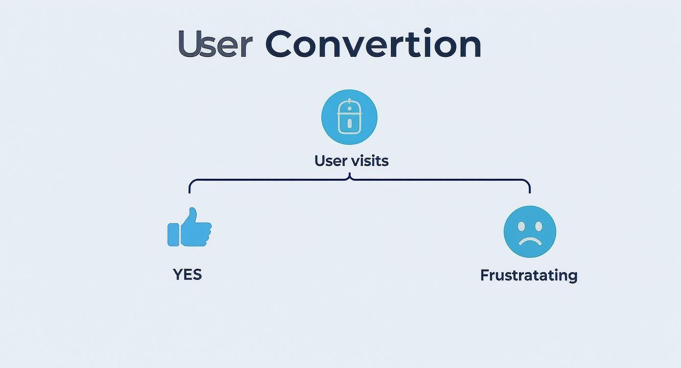
As you can see, a great user experience points straight to a sale, while a frustrating one sends customers running. This is exactly why your platform choice matters so much.
All In One Platforms Like Shopify
Platforms like Shopify are famous for being incredibly easy to get started with. They’re designed to get you online and selling fast, no technical wizardry required. We call these “software as a service” or SaaS platforms, where you pay a monthly fee for a complete, ready to go solution.
It’s a bit like renting a prime retail spot in a well managed shopping centre. Your rent covers the location, security, maintenance, and all the basic fittings. You just move in, arrange your products, and start selling.
But, just like in a shopping centre, you have to play by the landlord’s rules. You cannot just knock down walls or change the fundamental structure. While you can customise the look and feel, you are always working within their framework. This is perfect for a lot of businesses, especially those just starting out or anyone who values speed and simplicity over total customisation.
Flexible And Open Source Options
At the other end of the scale, you have solutions like WooCommerce, which is a powerful plugin for WordPress. This is an open source tool, which means the core software is free and can be modified by anyone. This hands you an incredible amount of control over every single pixel of your store.
This approach is like owning your own building. You are in charge of everything from the foundations to the roof, but you have the total freedom to design it exactly as you see fit. You can build bespoke features, connect to any service you can think of, and fine tune performance to your heart’s content.
Of course, that freedom comes with more responsibility. You’ll need to sort out your own hosting, security, and updates. It’s more hands on, but the reward is a shop that is 100% yours. To see what’s possible design wise, check out some of the top WordPress themes that are perfect for any website build.
The right platform is the one that removes technical roadblocks, allowing you to focus on what you do best: curating great products and building relationships with your customers.
Ultimately, the choice between a SaaS platform and an open source one often boils down to that trade off between convenience and control.
Comparing E-commerce Platform Options
To help you visualise the trade-offs, here is a quick comparison of the leading e-commerce platforms. This table breaks down the key differences to help you find the best fit for your business goals, budget, and technical comfort level.
| Platform | Best For | Ease of Use | Customisability | Typical Cost |
|---|---|---|---|---|
| Shopify | Startups, SMBs, and businesses prioritising simplicity and speed to market. | Very High | Medium | Monthly subscription (€25-€384/mo) + transaction fees. |
| WooCommerce | Businesses wanting full ownership and deep customisation, from small shops to large enterprises. | Medium | Very High | Free plugin, but requires hosting, domain, and potential developer costs (€30-€300+/mo). |
| BigCommerce | Growing businesses and established brands looking for built in features without transaction fees. | High | High | Monthly subscription (€29-€299/mo). |
| Custom/Headless | Ambitious, large scale brands needing unique user experiences and maximum performance. | Low (Requires Developers) | Unlimited | Varies widely, significant upfront and ongoing investment (€25,000+). |
Each option has its place. Your job is to match the platform’s strengths with your business’s specific needs and ambitions for growth.
The Headless Commerce Approach
For businesses that demand the absolute peak of flexibility and performance, there’s headless commerce. This advanced strategy separates the frontend of your website (the “head,” or what your customers see and interact with) from the backend ecommerce engine that manages your inventory, orders, and payments.
Imagine having a central warehouse and logistics system that can supply products to any number of unique storefronts. Those storefronts could be a website, a mobile app, a smart mirror, or even a kiosk in a physical store. The backend doesn’t care what the frontend looks like; it just serves up the product data on demand.
This setup gives designers and developers complete freedom to build breathtaking, lightning fast user experiences without being held back by a traditional platform’s template structure. It is a more complex and typically more expensive path, but for brands focused on innovation and creating truly standout digital experiences, it offers unrivalled power. It’s the top choice for ambitious web design and ecommerce projects.
Integrating SEO and Performance into Your Design
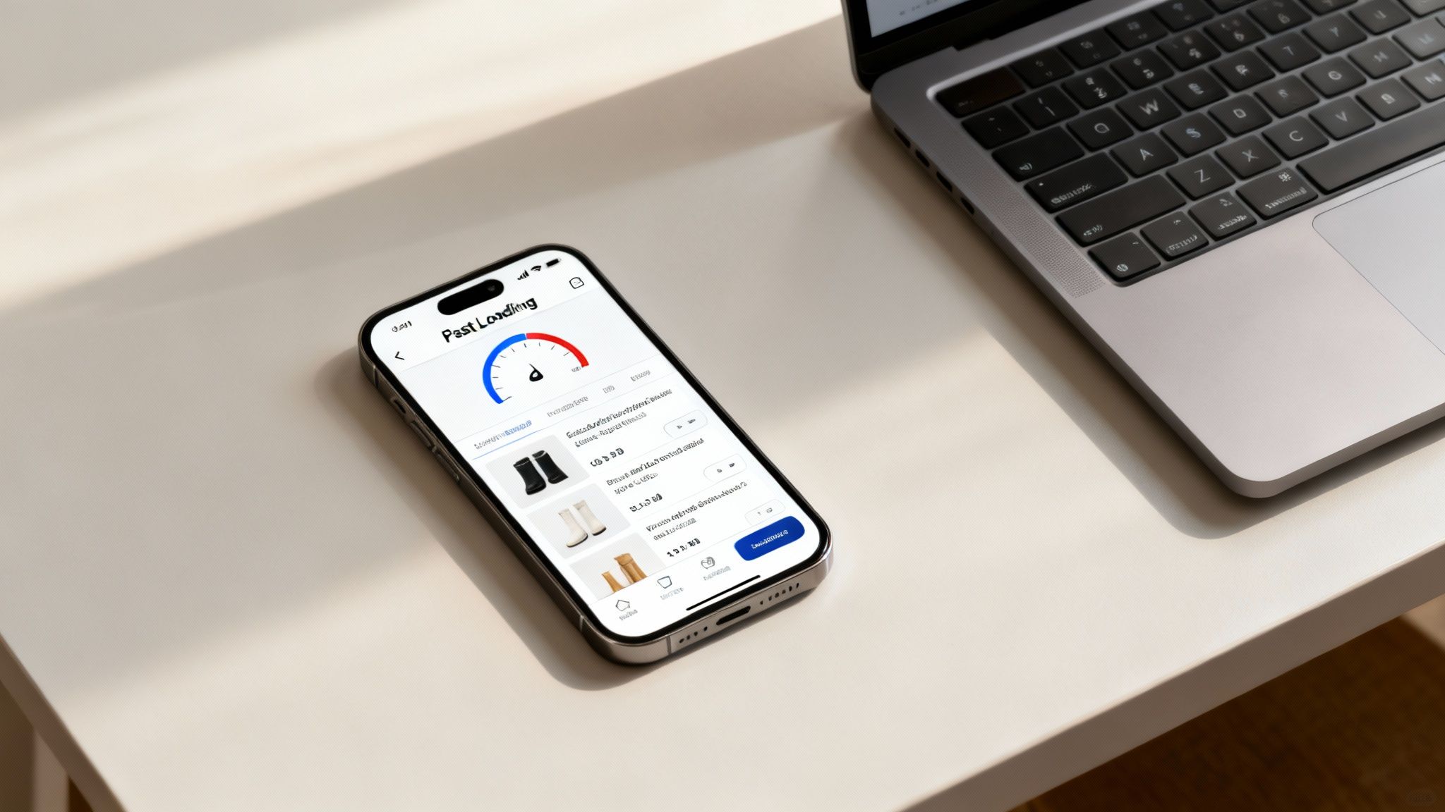
A stunning e-commerce website that no one can find is like a secret shop tucked away in an unmarked alley. It might be brilliant inside, but all that potential goes to waste. That’s why search engine optimisation (SEO) and performance are not just addons; they are fundamental parts of the web design and ecommerce process from day one.
Think of SEO as the signposts that guide Google to your front door. Performance, especially site speed, is the experience customers have the moment they step inside. A slow-loading page is the digital equivalent of being left standing at the counter while the staff ignore you. It is really no surprise that even a one second delay in page load time can lead to an 11% drop in page views.
Great design and rock solid technical performance are not competing priorities. They are two sides of the same coin, working together to pull in new customers and give them an experience that makes them want to stick around.
Building for Speed and Visibility
When we talk about performance, what we’re really talking about is speed. In the world of ecommerce, every millisecond truly matters. Shoppers have come to expect a fast, seamless journey, and search engines like Google actively reward sites that provide it with better rankings.
This means technical decisions made during the design phase directly influence your visibility in search results. A heavy, bloated design might look flashy, but if it takes an age to load, it will actively hurt your chances of reaching new people.
Treating performance as a design feature, not just a technical task, is a crucial mindset shift. It leads to better user experiences and stronger SEO. Your website’s speed is a direct reflection of your respect for the user’s time.
Just think about the data search engines are constantly gathering. They analyse how quickly your pages load and what people do once they arrive. If visitors consistently hit the back button because your site is too slow, that sends a clear signal of a poor user experience, which can gradually pull your rankings down.
Practical Steps for Performance Focused Design
So, how do you actually bake performance into the design process? It starts with being deliberate about every single element you add to a page.
- Optimise Your Images: Massive, uncompressed images are one of the most common reasons for a slow website. It is essential to compress them without turning them into a blurry mess. For a complete guide, these actionable tips to optimize images for SEO cover everything from file names to alt text.
- Embrace Clean Code: A well-structured site built with clean, efficient code is just naturally faster. This often means being disciplined about plugins and avoiding overly complex scripts that bog things down.
- Prioritise Mobile Performance: With most shoppers browsing on their phones, your site absolutely must be lightning fast on mobile devices. Adopting a mobile first design approach forces you to build a lean and quick core experience from the start.
These are not just technical chores; they are genuine design decisions. Opting for a simpler layout or a more efficient animation has a direct, positive impact on building a faster, more visible online store.
Structuring Your Content for Search Engines
Beyond raw speed, SEO is about making it easy for search engines to understand what your site is about. Good design brings order to information, making it clear for both your customers and the search engine crawlers.
This involves using a logical heading structure (H1, H2, H3) to create an outline for your page’s content, almost like a table of contents in a book. It also means crafting clear, descriptive titles and descriptions for your products.
For any e-commerce store, this structure is non-negotiable. Your product pages, category pages, and any blog content should all be organised in a way that makes logical sense. When Google can effortlessly crawl and index your site, it stands a much better chance of showing your products to people who are actively looking for them. This structured approach to content is a cornerstone of successfully blending great web design and ecommerce.
7. Crafting a Frictionless Global Checkout Experience
The checkout is the last, and arguably most important, hurdle in any online sale. It’s that final moment where a browser becomes a buyer, and even the smallest bit of friction can derail the entire process. Think of it as the digital version of a long queue at the till – if it’s confusing, slow, or feels untrustworthy, people will simply walk away.
A clunky checkout is the number one killer of conversions. Every unnecessary field a customer has to fill in, every confusing instruction, and every unexpected delay adds a little more doubt to their mind. That is why offering a simple guest checkout is often a game changer; it removes the big commitment of creating an account just to buy one thing.
Simplifying the Final Step
Your one and only goal here is to make paying feel effortless and completely secure. The best place to start? Cut the number of form fields down to the bare essentials. Do you really need their phone number right now? Can you use an address auto-filler to save them a few seconds of typing?
Little design cues can build a huge amount of trust. Prominently displaying security badges from well-known payment gateways like Stripe or PayPal instantly reassures customers that their financial data is safe. It is also vital to be completely transparent about all costs – shipping, taxes, everything – right from the start. No one likes a nasty surprise on the final payment screen.
The perfect checkout experience is one the customer barely remembers. It should be so intuitive, fast, and reassuring that it becomes an invisible final step in a positive shopping journey.
These fundamentals become even more critical when your ambitions go global. What feels normal and trustworthy to a customer in Ireland might seem completely alien to someone shopping from Germany or Brazil.
Speaking the Language of Local Payments
Selling internationally is about much more than just converting prices into the local currency. You need to offer payment methods that people in that specific region actually know and trust. For instance, expecting a customer in Brazil to pull out a credit card when they’re used to paying with Pix is a sure fire way to lose the sale.
This pattern repeats all over the world. A shopper in the Netherlands will actively look for an iDEAL option, while someone in Germany might prefer Giropay. Integrating these local payment systems shows you understand their market, and it does wonders for your conversion rates.
This is especially true when looking at high growth regions. Despite a recent surge, Latin America’s e-commerce penetration is often below 12%, which points to a massive opportunity. Countries like Paraguay (9.3%) and Peru (8.8%) are brimming with potential for businesses that get the local checkout experience right. You can explore more data on these untapped ecommerce markets on ecdb.com.
Of course, managing taxes is another huge piece of the puzzle. Getting your VAT and sales tax right is non-negotiable for avoiding legal headaches and keeping customers happy. If you’re on WooCommerce, our guide explains how to correctly set up WooCommerce VAT rates for different countries.
Innovating the Future E-commerce Experience

How does an online shop actually stand out when thousands of competitors are just a click away? The answer is not about having the lowest price or the loudest marketing. It’s about creating an experience that is genuinely memorable. This is where clever technology takes web design and ecommerce from a simple shopfront to a destination people want to visit.
We are quickly moving past the era of flat, static product pages. The future is interactive and immersive, designed to build a real connection with customers long before they even think about the “add to cart” button. It is all about using technology to solve an age old problem: closing the gap between seeing something online and knowing what it is really like in person.
Bringing Products to Life with Interactivity
Let us face it, standard product photos often do not cut it anymore. They do not build the confidence needed for someone to commit to a purchase. The brands getting ahead are using interactive elements to give customers a much better feel for their products, which helps clear up doubt and makes the whole process more enjoyable.
Imagine you are shopping for a new sofa. Instead of just seeing a few static pictures, you use a 3D product viewer on the website. You can spin the sofa around, zoom right in on the weave of the fabric, and check it out from every conceivable angle. This kind of tool gives you a level of detail that you used to only get by visiting a physical showroom, and that is a powerful way to build trust.
Augmented reality (AR) is another brilliant example. Think of someone trying to buy a new pair of glasses online. An AR “try on” feature lets them use their phone’s camera to see exactly how different frames look on their own face. This is not a gimmick; it is practical, helpful technology that removes a huge barrier to buying and, frankly, makes it fun.
The goal here isn’t just to be flashy. It’s about creating genuine utility and building an emotional connection. When a customer can truly visualise a product in their own space, their desire for it and their trust in the brand grow enormously.
Creating Immersive and Memorable Experiences
These interactive tools do more than just showcase products; they create moments that stick with people and build loyalty. When a customer can use their phone to see if that armchair actually fits in their living room, that is an experience they are going to remember and probably tell their friends about.
This push towards more engaging digital shopping is happening everywhere. In Latin America, for example, the ecommerce market is exploding, and it is largely being driven by high smartphone use. In 2023, Brazil alone had over 180 million smartphone users—that’s roughly 85% of its population. With the entire regional market forecast to hit USD 1.45 trillion in 2024, the demand for mobile first, immersive experiences is only going to get stronger. You can find more details on this expanding market on marketdataforecast.com.
Ultimately, the brands that get this right—the ones that successfully weave these innovations into their online stores—are the ones that will shape the future of retail. They understand that a single purchase is just one small part of a much bigger relationship with their customers.
Frequently Asked Questions
Diving into ecommerce web design naturally brings up a lot of questions. It is a world where creative vision meets technical reality, and every choice can impact your sales. Let us tackle some of the most common queries business owners have.
How Much Does An Ecommerce Website Cost?
This is always the first question, and the honest answer is: it depends entirely on what you need. An ecommerce site can cost anything from a few thousand euros for a straightforward template build to over €100,000 for a large scale, custom designed platform.
Think of it like building a house. A prefabricated kit is one price, but a custom built home designed by an architect is in another league altogether. The final figure comes down to the complexity of your design, the specific features you need, and the technology stack we use to build it.
A startup might get off the ground perfectly with a platform like Shopify, keeping initial costs down. In contrast, an established brand needing complex integrations with their stock management and logistics software will be looking at a much larger investment.
How Long Does It Take To Build An Online Store?
Just like the cost, the timeline is all over the map. You could get a basic, theme based shop live in a couple of weeks if you have all your content ready to go.
However, a proper custom web design project—one that includes strategy, user experience (UX) design, development, and thorough testing—typically takes anywhere from three to nine months. Sometimes longer.
What stretches out the timeline? A few usual suspects:
- Customisation: Every unique feature or bespoke design element adds time to the build.
- Content Readiness: The biggest bottleneck is often waiting for professional product photos, well written descriptions, and other essential content.
- Revisions: The back and forth of feedback and changes can significantly extend the project schedule.
What Is The Best Ecommerce Platform?
There’s no single “best” platform—only the best one for your business. It all comes down to your goals, your budget, and how comfortable you are with the technical side of things.
If you want to get up and running quickly with minimal fuss, platforms like Shopify are fantastic. They manage all the complex backend stuff, so you can concentrate on marketing and selling your products.
But if you need total creative control and deep customisation, an open source option like WooCommerce for WordPress gives you the power to build almost anything you can imagine.
The right platform should feel like a partner in your business, not a technical roadblock. It needs to handle what you’re doing today and have the flexibility to grow with you tomorrow.
The key is to match the platform’s strengths to your unique business needs, not the other way around.
Article created using Outrank