CASE_STUDY // 02 · RAGEANDREPS.LIFE
Rage & Reps is a 30-day programme for women rebuilding after betrayal and divorce. The audience arrives raw, often at 2am, usually on a phone. Our scope was design and build: make something that feels serious without being bleak, and make starting feel manageable rather than daunting.
Client
Sector
Engagement
Status
At a glance
Designed & built from scratch
Daily practices to communicate
Pricing tiers to differentiate
Pages and sections structured
Checkout routes integrated
No SEO or ads in this scope
The brief
Most websites are designed for a visitor who is curious. This one is designed for a visitor who is hurting, sceptical of anything that sounds like a cure, and has probably been let down by advice already.
That changes every design decision. Enthusiasm reads as insensitivity. Stock-photo serenity reads as fake. Long explanations do not get read, because concentration is one of the first things to go.
The brand had the answer in its own language — no fluff, no guilt, just seven minutes that count — and the job was to build a site that kept that promise in its structure, not only in its words.
Design decisions
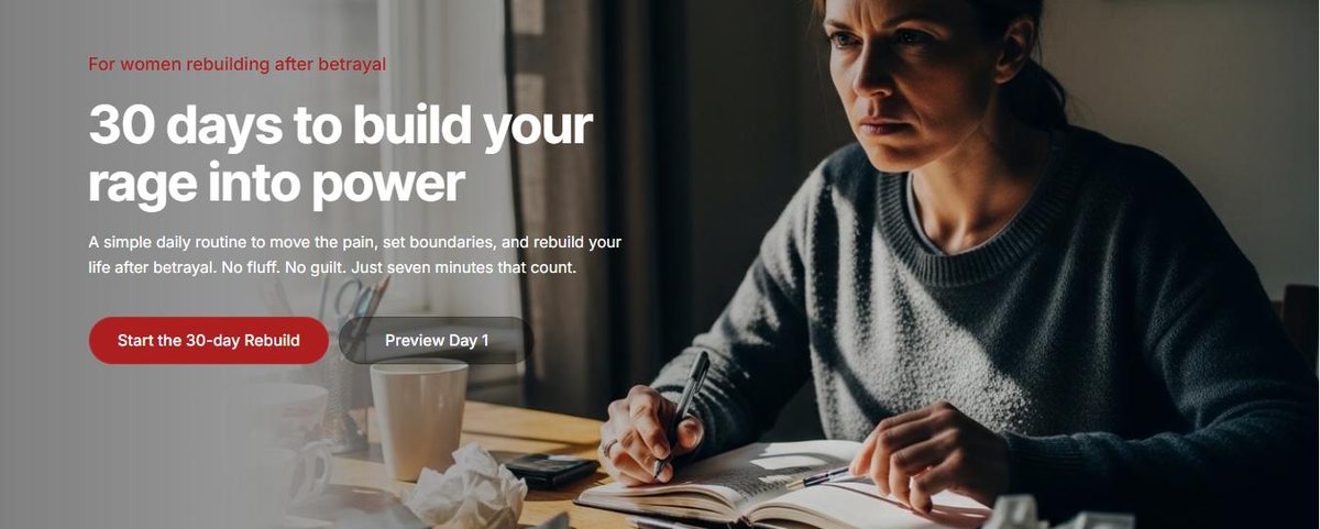
The hero offers two actions: start the 30-day rebuild, or preview day one. The second exists because the first is too big an ask for someone who is not ready. A free look at a single day removes the leap of faith.
Immediately below the hero: three plain statements of who this is for. Rebuilding after betrayal. Stuck, angry or numb. Done apologizing. Recognition comes before any pitch, so nobody has to read a sales page to work out whether it applies to them.
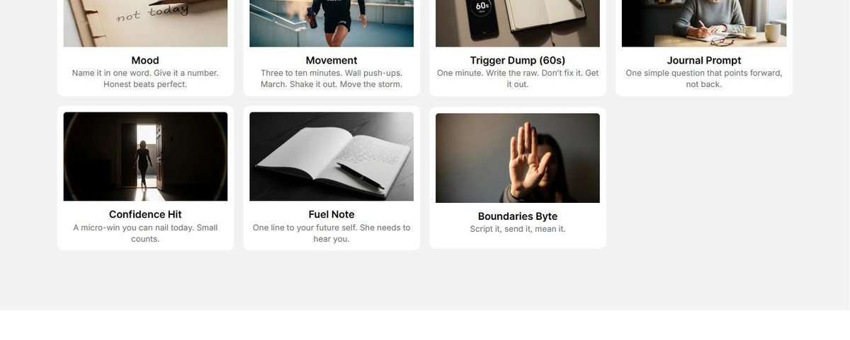
The daily routine is seven small practices — mood, movement, trigger dump, journal prompt, confidence hit, fuel note, boundaries byte. We gave each one its own card with one line of explanation, so the whole commitment is visible at a glance instead of described in a paragraph.
The FAQ answers “Is this therapy?” with a direct no, and the site carries its own disclaimer and refund pages. For a product in this territory, stating the boundary clearly is both an ethical obligation and the thing that makes the rest credible.
Pricing & commerce
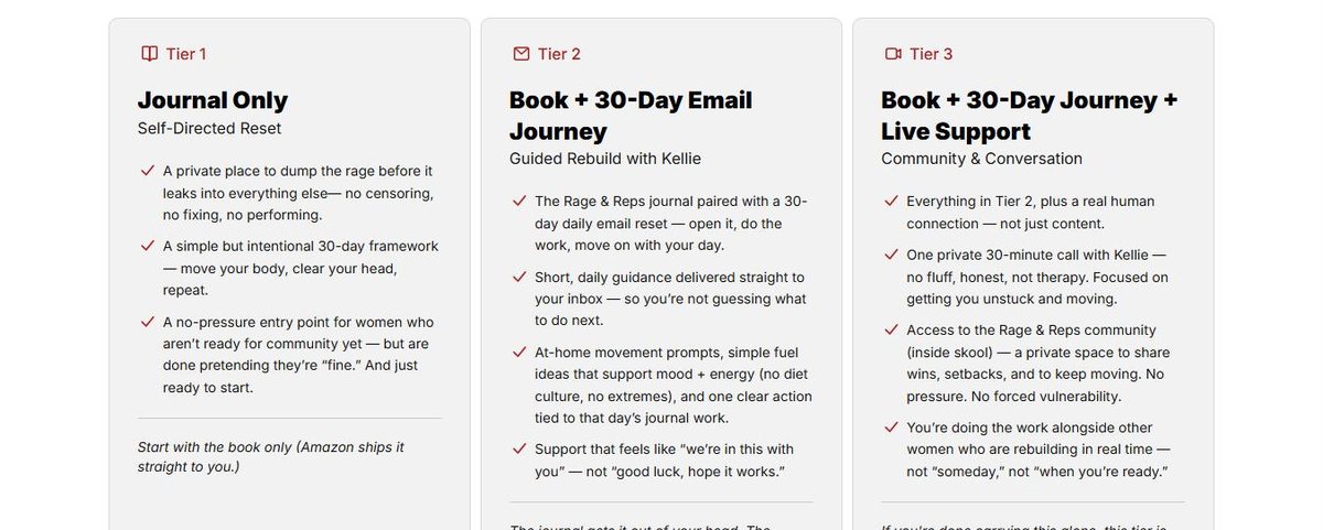
The programme sells at three levels: the journal on its own, the journal with a 30-day guided email journey, and both plus live support and community access. The design problem is familiar but sharper here — the entry tier is for women who are not ready for community yet, and it has to feel like a legitimate choice rather than the budget option.
So each tier leads with who it suits rather than what it withholds, and the lowest tier is described as a no-pressure entry point instead of a cut-down version.
Checkout runs through two routes: the book ships via Amazon, the guided tiers run through hosted payment links. Neither required a full storefront, which kept the build lean.
Also built
Beyond the main page, the build covers a merchandise shop, a longer-form “Real Talk” section, an about page, a free Day 1 preview, and the full set of policy pages a product in this category needs.
Shop — apparel & journals
Real Talk — long-form content
About
Free Day 1 preview
Stories
FAQs
Privacy & terms
Refund policy
Disclaimer
Scope
Design and build only. No search, content or advertising work formed part of this project, so this case study carries no traffic or ranking figures — there are none to report.
Website design
Website development
UX & interface design
Mobile-first responsive build
Information architecture
Content structure
Payment link integration
Free 30-minute audit
Some products are hard to sell because the buyer is in a difficult place. That is a design problem before it is a marketing one. If that sounds like yours, we should talk.