CASE_STUDY // 03  ·  ALEXFREDERICKS.COM

One person, two decades of work,

and ninety seconds to prove it.

Alex B. Fredericks advises founders and leadership teams on positioning, go-to-market and growth systems. Work like that is won on credibility, and credibility has to be established before a prospect decides to read on. We designed and built the site that does it.

Alex B. Fredericks

Client

Executive advisory

Sector

Design & build

Engagement

Live

Status

At a glance

Full site

Designed & built from scratch

6

Pages structured and written

3 seconds

Target to establish credibility

Direct booking

Calendar integrated, no forms

4

Proof points above the fold

Design only

No SEO or ads in this scope

The brief

Selling expertise is harder than selling a product.

A product can be demonstrated. Advisory cannot. What Alex sells is judgement built over twenty years across consumer and enterprise — positioning, partnerships, go-to-market sequencing, investor strategy. None of that is visible, and all of it has to be believed before anyone books a call.

The buyer is a founder or an operator: short on time, sceptical of consultants, and well practised at spotting people who describe strategy without having run any. They will give the page a few seconds before deciding whether this is a serious person.

So the design question was not how to look impressive. It was how to make two decades of work legible fast, and then get out of the way.
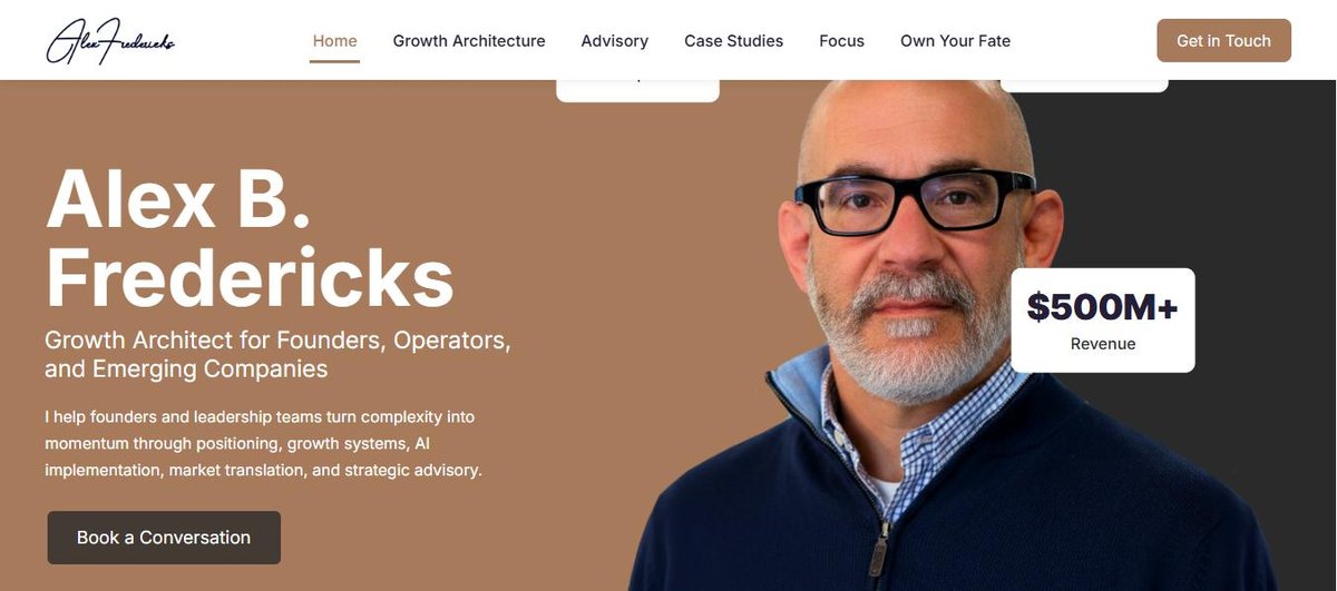
Alex B. Fredericks website homepage with track record shown beside the portrait

Design decisions

Four choices that shaped the build.

01

Put the numbers beside the face

Years, launches and revenue sit as floating cards against the portrait in the hero. A visitor takes in the person and the track record in the same glance, before reading a single sentence of prose.

02

Name the offer in four tiles, not four paragraphs

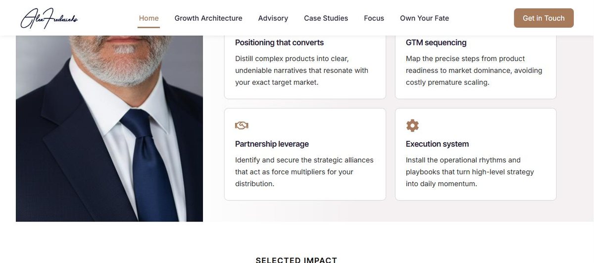
Positioning, GTM sequencing, partnership leverage, execution system. Each with one line explaining what it does. An advisor’s work resists description, so the structure does the work that adjectives cannot.

03

Make the proof specific

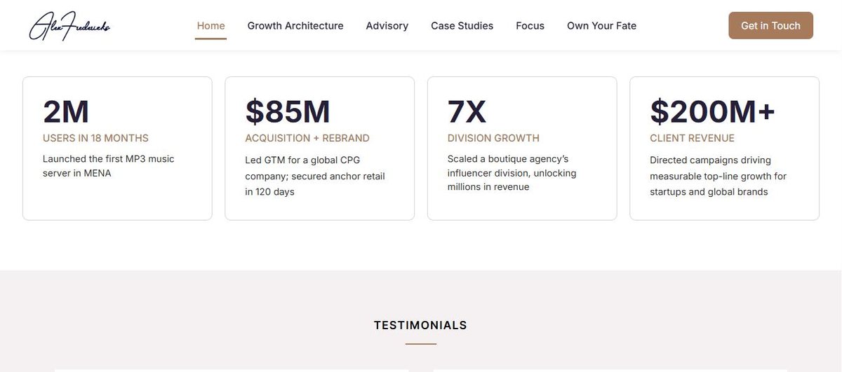
The impact section carries four concrete outcomes rather than a client logo wall — what happened, at what scale, in what timeframe. Specifics survive scrutiny from the exact audience most likely to apply it.

04

Book directly, skip the form

Every call to action opens a calendar with real availability instead of a contact form. For a senior buyer deciding in the moment, removing the wait between interest and booking is worth more than any extra field of qualification.

The four advisory service tiles on the Alex Fredericks website

Structure

Six pages, each doing one job.

The site is deliberately small. An advisory practice does not need depth of content; it needs a short, confident path from arrival to booked conversation.

Home establishes credibility. Growth Architecture and Advisory separate the two ways of working with him, so a visitor can self-select rather than read about both. Case Studies carries the evidence. Own Your Fate holds his longer-form thinking. Contact books the call.

Nothing is padded to look bigger than it is — which for a single-operator practice is itself a signal of confidence.

The selected impact figures on the Alex Fredericks website

Scope

What this engagement covered.

Design and build. No search, content or advertising work formed part of this project, so there are no traffic or ranking figures to report here.

Website strategy

Custom website design

Website development

UX & interface design

Mobile-first responsive build

Content structure

Calendar booking integration

Free 30-minute audit

Selling expertise rather than a product?

Advisory, consulting and professional practices all share the same problem: the thing being sold is invisible until someone trusts you. That is a structural problem a website can solve. If it is yours, we should talk.